What Colors Photograph Best (And Which to Avoid)
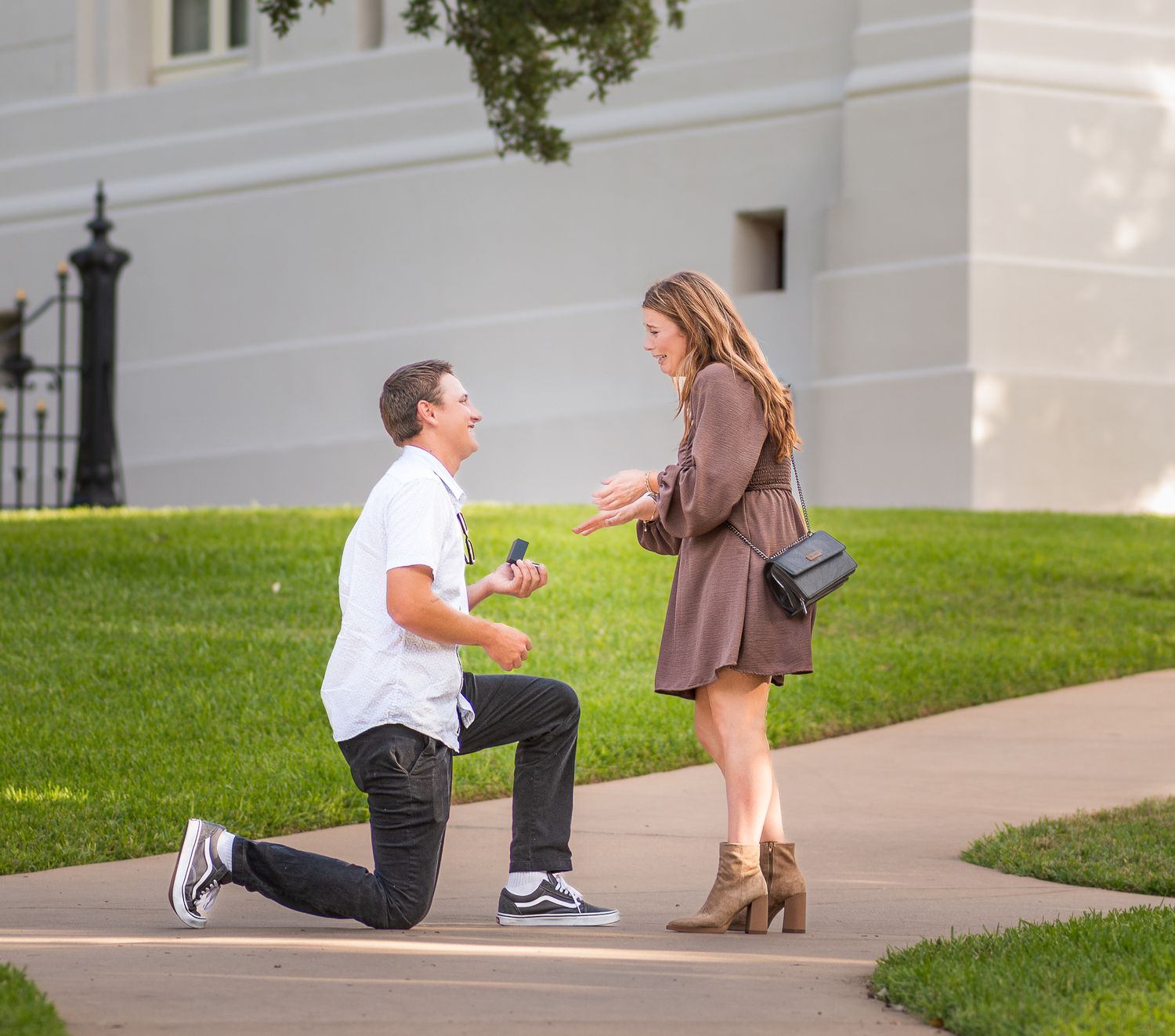
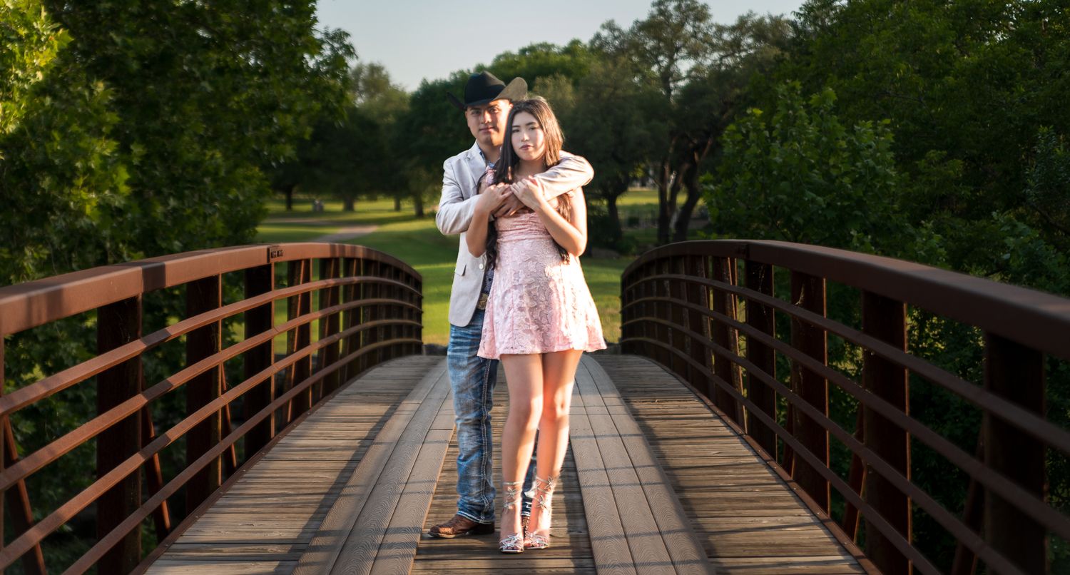
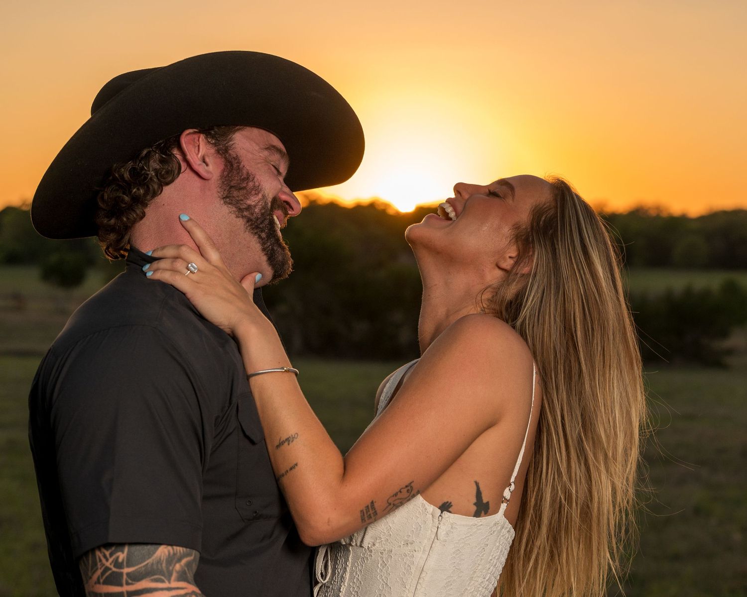
One of the most common questions clients ask before a photoshoot is, “What should I wear?” And right after that comes the real concern: what colors photograph best?
The good news? You don’t need a whole new wardrobe. A few smart color choices can make a big difference in how polished, timeless, and flattering your photos turn out.
Here’s a simple, photographer‑approved guide to choosing colors that look great on camera — especially for outdoor sessions around Austin.
Colors That Photograph Beautifully
Neutrals (Always a Win)
Neutrals are classic for a reason. They photograph cleanly, don’t distract, and keep the focus on you.
Great options include:
•Cream
•Beige
•Camel
•Gray
•Navy
•Soft white
Neutrals also mix well in group or family photos without looking too matchy.
Earth Tones (Perfect for Outdoor Sessions)
Earth tones look especially good in natural light and Austin’s outdoor settings.
Try:
•Olive green
•Rust
•Terracotta
•Mustard
•Warm browns
These colors add depth without overpowering the photo and work beautifully in parks, fields, and urban nature spots.
Soft, Muted Colors
Muted shades photograph better than very bright ones because they don’t reflect too much light.
Examples:
•Dusty blue
•Sage
•Mauve
•Soft blush
•Muted teal
These are great for headshots, couples, and family sessions alike.
Colors to Be Careful With
Bright Neons
Neon colors reflect light onto skin and can cause strange color casts. They also pull attention away from your face.
Busy Patterns & Logos
Small patterns, bold stripes, or large logos can distract and sometimes create odd visual effects on camera.
Pure Black or Stark White
These can work, but they’re tricky: - Pure black can lose detail in shadows - Stark white can blow out highlights
If you love these, choose softer versions like charcoal or cream instead.
Group & Family Photo Tips
If you’re coordinating outfits for more than one person:
•Pick a color palette, not identical outfits
•Mix light and dark tones
•Keep patterns limited to one person at most
This creates visual balance while still letting everyone look like themselves.
Headshots: Keep It Simple
For professional headshots, solid colors almost always work best. Think clean, timeless, and intentional. Great headshot colors:
•Navy
•Gray
•Soft blue
•Olive
•Cream
Avoid anything that feels trendy or loud — you want your headshot to age well.
When in Doubt, Ask
If you’re ever unsure, I’m always happy to help you choose outfits before your session. A quick photo or description goes a long way in making sure your photos look cohesive and flattering.
The right colors won’t just make your photos look better — they’ll help you feel more confident stepping in front of the camera.
If you’re planning a photoshoot in the Austin area and want guidance from start to finish, feel free to reach out anytime.